Sunday, October 16, 2011

Blog #6 - Animation Deconstruction


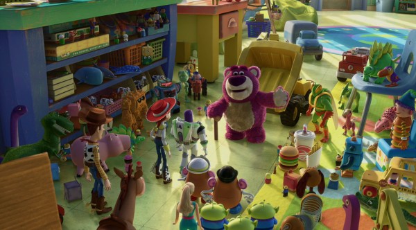
These images are both from Pixar's Toy Story 3. In the first image, the bear is showing the Toys around their new home in the day care center. While they (the day care's occupants) appear to be friendly, the lighting in this scene foreshadows and symbolizes their true intentions. The hue is almost that of a sickly green, which gives the impression that they can't be trusted and have not so hospitable intentions. In fact, if you look closely, a creepy reptilian like toy is standing next to the bear. Not only does he look creepy, but his colors (shades of green) resemble that of the lighting. In addition, the characters that can't be trusted also appear to cast longer, darker shadows than the characters we know to be good guys. The bear's colors of purple are also intended to throw the audience off guard, because we generally associate purple to be a color of purity. However, if you look closely, the purple is tarnished with patches of dirt. The lighting the bear is in also casts an eerie shadow across his body, further exemplifying the diminishing situation in the movie. 

In the second picture, our characters are in a dire situation. However the overall impression of hope and bravery is conveyed through the contrasting of the background with the foreground. This scene takes place at night, so the sky is very dark and the day care center in the background looks menacing. In addition the characters are standing in front of a fence which stretches across the entire frame, which gives us the sense  that they are trapped. However, the characters are cast in bright light, which gives us a massive contrast with the background. The background is dark, while the foreground (and the characters) are well lit. In addition to their positions and facial expressions, this image tells us that the characters will be successful in their endeavors even though the situation is dire, that they will be able to "climb any mountain (fence, in this case)"and overcome any obstacle. 

These two images contrast because the first image gives us a sense of danger and foreboding, while the second image projects hope and bravery since our characters appear to be surviving in dangerous circumstances. 
Thursday, October 13, 2011


Spiderman - Final Scene Storyboard


Camera Positions


The storyboard is based off of the final scene from Spiderman 1. In it, Peter Parker is reflecting on his identity and mourning the death of his Uncle. The shot begins with a close up of Ben Parker’s gravestone, where we see the extreme left side of Peter. The second shot reverses positions and we see a close up of Peter’s face, showing us that he is having internal conflict. The third shot moves out and we see an extreme wide shot of the graveyard, where Mary Jane enters the scene and catches Peter’s attention, walking towards him. The 4th shot is a close up of Mary Jane and Peter hugging, Peter facing the camera and Mary Jane facing away. The final shot is a reversal, giving us a close up of Mary Jane with Peter facing away, still in a hug.

In these shots, the director stuck to the 180 degree rule. The camera never moves to the other side of the line established when Peter is looking at the gravestone, and when the new line is established when he and MJ meet and hug. The 30% rule is followed as well. Whenever a same angle shot changes, it goes from an extreme wide shot to a close up. However, judging from the video on YouTube, the 1/3 rule was not as closely followed. Many of the main objects were closer to the middle than the 1/3 crosshairs. For example, Ben Parker’s grave is centered in the shot, and in the next shot of Peter, he is framed close to the center. When he and MJ are hugging, neither one are perfectly placed in the 1/3 positions. The only explanation I have for this is that because the shots don’t exactly follow what we would come to expect, it reflects the inner conflict that the characters in the scene are feeling. 


Tuesday, October 11, 2011

Blog #4 - Song Deconstruction


LISTENING FRAMEWORK
LISTENING PHASE 1 (Rhythm)
Tempo [slow, medium, fast]
Slow for the introduction, the medium afterwards
Source [where is the rhythm coming from?]
In the intro, the synths carry the song. Afterwards the drum set creates the main rhythm
Groove [describe how the personality of the rhythm]
Rhythm is relatively steady except for some moments at the end of a verse where there is some added cymbal crash.
LISTENING PHASE 2 (Arrangement)
Instrumentation [which instruments drive the song?]
Synthesizers, electric guitar, drums
Structure/Organization [how is the song built? Order, patterns, etc.]
Intro with just synthesizers, middle with mainly synth and drums (a little electric guitar), electric guitar solo, mainly synth and drums.


Emotional Architecture
[Draw how the song build and drop?]


LISTENING PHASE 3 (Sound Quality) Balance
         -  Height [high and low of frequency] Medium to high
         -  Width [stereo panning left/right] Neutral
         -  Depth [layers of instruments - via loudness] Good depth, can hear each part.

LISTENING FRAMEWORK
LISTENING PHASE 1 (Rhythm)
Tempo [slow, medium, fast]
Medium throughout
Source [where is the rhythm coming from?]
Snare drum, primarily
Groove [describe how the personality of the rhythm]
Beat is constant with little or no variation. Drums stick to the same rhythm
LISTENING PHASE 2 (Arrangement)
Instrumentation [which instruments drive the song?]
Brass (Trumpet, Trombone, Tuba, Mellophone), Percussion (snare, bass, cymbals)
Structure/Organization [how is the song built? Order, patterns, etc.]
Verbal countdown, Instrumental

Emotional Architecture
[Draw how the song build and drop?]


LISTENING PHASE 3 (Sound Quality) Balance
         -  Height [high and low of frequency] Medium to high
         -  Width [stereo panning left/right] Neutral
         -  Depth [layers of instruments - via loudness] Marching band, mostly brass, not much depth

The first song is from the original “The Final Countdown” music video by Europe. The second is a cover of the song by a high school marching band. The first obvious difference is that the original song contains lyrics, whereas in the marching band version, the lyric line is taken over by brass instruments, mainly trumpets. Therefore, there are no lyrics in the band version. The melody remains intact however, with the exception of the beginning. In the original video, the synths rev up to provide a “countdown” to the start of the song. In the marching band version, the countdown is provided verbally by the band members. The melody then takes over and continues until where the guitar solo would be in the original song, but then ends instead of giving a “solo” to another instrument.

While the original song has varying tempo for the beginning, main, and end, the marching band version keeps a steady medium paced tempo throughout the song. This may be due to it being hard to march to varying tempos. The drums in both versions seem to keep a fairly constant rhythm, however the instrumentation is very different between the two. The original song uses synthesizers, electric guitar, bass guitar, and drum sets. In the adapted band version, we have standard marching instruments: trumpets, trombone, sousaphone, mellophone, tenor/alto sax, percussion, and probably clarinets and flutes, although you can’t hear them. Theoretically there should be more depth in this version, because there are more instruments, but since most of the instruments combine to provide the melody, the melody is the most dominant element of the song, and there is not much going on in the background except for the drums. The sound is very flat, as opposed to the original video, where we can hear each instrument part.

Overall I like the original song better because it comes together in a more professional manner and having the lyrics makes the song very enjoyable. However, I am in marching band, so I have a respect for the band version, because it is not easy to march and play this song at the same time.