Sunday, November 6, 2011

Blog #9 - Freak Factor


In this article, David Rendall talks about identifying our weakness and gives suggestions to “improve” upon them.

I think that his suggestion “Fix it” has valid and not so valid points. First, I believe that we should all learn to live with our own weaknesses, because that is what makes us unique individuals. If everyone on this planet were the same, perfect, or both, then the world would be a terrible place because there would be no variety. We would all have the same job, same thoughts, same interests, and same life. Just the thought of that makes me shudder. That said, however, I believe that while we should accept our uniqueness (weakness and all), it should not be wrong to try and improve our weaknesses. Sometimes weaknesses cannot be forgotten because they inhibit how well someone lives their life. An example of this would be the tendency to look at life in a negative manner. Being around negative people, brings positive people down, and brings negative down even farther. I know for a fact that you can change from having a negative to a positive outlook, so if it’s possible and will improve your life, why not?

Secondly, I agree with Rendall’s suggestion of “foundation”. Unless the weakness is one that puts a damper on the ability to live one’s life, then it should be left alone. Instead, ignore these weaknesses and make up for them by bettering yourself in something that you are already good at! Or setting the foundation for something that you COULD be good at! I’ve always been under the impression that I couldn’t draw. However, recently I realized that it would help my skill set very much if I learned how (and specifically, learned how to use Photoshop). I purchased a cheap graphics tablet and after a few days I was drawing things that were slightly beyond the level of stick figures. It felt great! I’m now planning on drawing more challenging things to improve on the foundation I’ve laid. That in turn is simply improving on the strength that I know I have, and that is the ability to be creative. 

Finally, I appreciated Rendall’s use of the “Rudolph the Red Nosed Reindeer” song to describe the concept of “fit in” because it is absolutely true. If you are trying to involve yourself with a group of people, a job, or an activity, then you want to fit comfortably with them. In other words, find a place in which you can absolutely improve yourself, and your strengths are admired instead of your weaknesses called out. If you try to fit in with the wrong people, job, or activity, then in most likelihood your weakness will be most prominent and it will be hard to show off and build on your strengths. In an environment that is not conducive to your growing and improving on what you are good at, then you will simply be miserable. That is why it is so important to find people who appreciate you for you, to find a job that you enjoy and are good at, and similarly to involve yourself in activities, which depict you as someone with strength (but not necessarily physical strength)

As far as the creative process goes, my greatest strength is probably my ability to visualize HOW I want something to look. When I’m thinking about a shot, or a concept, I have a very specific “vision” of how it should look, from the camera moves, to the action taking place in front of the camera. My greatest weakness is conveying that vision or idea to other people visually. That is one reason I am doing everything I can to teach myself how to draw using Photoshop. If I can express my ideas and concepts through storyboarding and concept art, then I will have taken my weakness and turned it into something that I can use to further my understanding of the creative process. 
Blog # 8 - Brainwashed


One of the major layers that Godin talks about is “Acknowledging the Lizard”. Essentially, we all have a voice in our head that, when we step outside of the standard, tells us that that what we are doing is not right and attempts to pull us back so that we will not be laughed at. To acknowledge that we have this voice is the first step to overcoming it. Failing was also an important pillar, because it is not the first thing people will think of when asked on how they can improve themselves. On the contrary however, failing teaches us what we should and should not do, and makes us better people for it. Finally, shipping stood out to me, because even if you fail in the process, getting an idea or product out and implementing it is essential to success.

The blog that we are putting together this quarter allows us to implement several of these layers. The three most important to me, acknowledging the Lizard, failing, and shipping, are implemented in the creation of this blog, and allows us to learn more about the creative process.

First, acknowledging the lizard comes into play because, when dealing with the media industry (or anything media related), we need to learn how to think outside the box; to think of new ideas and create new things that spark new interests. If knew ideas were not constantly being thought of, the media industry would have died before it even got started. By acknowledging the lizard, we help ourselves to not be afraid to try new things, to share new ideas or interpretations. That is essentially what our blog is about, sharing ideas and interpretations. No two blogs are the same because everyone interprets things differently, and therefore we must silence the lizard so that we may fearlessly share these ideas and interpretations.

Without the ability to ship our ideas, there would be no purpose to the blog. The fact that it is now accessible, that our ideas are accessible to anyone connected to the internet, gives the blog purpose and therefore allows us to ship our thoughts and ideas to anyone on the web. It also allows us to build a portfolio of sorts to “ship”, or share with potential employers the way we look at the creative process. This puts us ahead of the curve, because like the article said, those who are shipping their ideas or products are so much farther ahead than those who are not. Those who believe that earning a degree is enough for a job and have nothing to show for their ability are simply out of luck.

Finally, while not as much a factor as the others, failing to understand an idea on the blog allows us a safe place to learn from those mistakes. As opposed to the real world, failing at an important job might mean serious consequences that could result in the loosing of that job. With the blogs this is not the case, and it allows us to actually change and manipulate what we have written if we learn that it is actually incorrect. Essentially, the blogs are a way to share what we know, interpret what we see, and fix where we fail.  

Blog #7 - Scene Deconstruction


http://www.youtube.com/watch?v=pfmkRi_tr9c

The primary theme in the Dark Knight revolves around good versus evil, and can be summarized by the quote, “You either die a hero, or you live long enough to see yourself become the villain” spoken by the good guy Harvey Dent. This scene is important because it shows how the Joker took the good guy’s words and used them against him. In this scene, we see how easy it is to fall prey to evil, and how easy it is for good moral values to be twisted to the bad guy’s wishes.


The most obvious component of this scene is the rhythm. It starts off very slow with what seems like seconds between pieces of dialogue. As the scene progresses, the pace quickens in terms of the dialogue. Sentences become faster and tension begins building towards a climax in the scene, which comes when Harvey points the gun at the Joker and leaves his life to chance, thereby completing the Joker’s goal of turning the good guy into an agent of evil. The scene also utilizes movement to compliment the rhythm. Harvey Dent, being severely injured in a fire (that the Joker is responsible for), is confined to his hospital bed, so he is immobile for the entire scene. This is important because while he is literally stuck on the hospital bed, but symbolically evil has trapped him because he is unable to escape while the Joker is implementing his plan (even though the Joker says he has no plan). While Harvey is being forced to lie on the bed and listen to the Joker, the Joker is able to move around, and does so as the scene progresses. It starts with the Joker several feet away from Harvey and as the scene progresses, he makes his way around the bed and gets up close to Harvey’s face. The closer he gets to Harvey’s face, the closer he is to achieving his goal. In addition, the Joker also begins talking to the disfigured side of Harvey’s face, which further symbolizes his motive to turn Harvey into an agent of evil. 

Sunday, October 16, 2011

Blog #6 - Animation Deconstruction


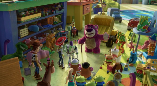
These images are both from Pixar's Toy Story 3. In the first image, the bear is showing the Toys around their new home in the day care center. While they (the day care's occupants) appear to be friendly, the lighting in this scene foreshadows and symbolizes their true intentions. The hue is almost that of a sickly green, which gives the impression that they can't be trusted and have not so hospitable intentions. In fact, if you look closely, a creepy reptilian like toy is standing next to the bear. Not only does he look creepy, but his colors (shades of green) resemble that of the lighting. In addition, the characters that can't be trusted also appear to cast longer, darker shadows than the characters we know to be good guys. The bear's colors of purple are also intended to throw the audience off guard, because we generally associate purple to be a color of purity. However, if you look closely, the purple is tarnished with patches of dirt. The lighting the bear is in also casts an eerie shadow across his body, further exemplifying the diminishing situation in the movie. 

In the second picture, our characters are in a dire situation. However the overall impression of hope and bravery is conveyed through the contrasting of the background with the foreground. This scene takes place at night, so the sky is very dark and the day care center in the background looks menacing. In addition the characters are standing in front of a fence which stretches across the entire frame, which gives us the sense  that they are trapped. However, the characters are cast in bright light, which gives us a massive contrast with the background. The background is dark, while the foreground (and the characters) are well lit. In addition to their positions and facial expressions, this image tells us that the characters will be successful in their endeavors even though the situation is dire, that they will be able to "climb any mountain (fence, in this case)"and overcome any obstacle. 

These two images contrast because the first image gives us a sense of danger and foreboding, while the second image projects hope and bravery since our characters appear to be surviving in dangerous circumstances. 

Thursday, October 13, 2011


Spiderman - Final Scene Storyboard


Camera Positions


The storyboard is based off of the final scene from Spiderman 1. In it, Peter Parker is reflecting on his identity and mourning the death of his Uncle. The shot begins with a close up of Ben Parker’s gravestone, where we see the extreme left side of Peter. The second shot reverses positions and we see a close up of Peter’s face, showing us that he is having internal conflict. The third shot moves out and we see an extreme wide shot of the graveyard, where Mary Jane enters the scene and catches Peter’s attention, walking towards him. The 4th shot is a close up of Mary Jane and Peter hugging, Peter facing the camera and Mary Jane facing away. The final shot is a reversal, giving us a close up of Mary Jane with Peter facing away, still in a hug.

In these shots, the director stuck to the 180 degree rule. The camera never moves to the other side of the line established when Peter is looking at the gravestone, and when the new line is established when he and MJ meet and hug. The 30% rule is followed as well. Whenever a same angle shot changes, it goes from an extreme wide shot to a close up. However, judging from the video on YouTube, the 1/3 rule was not as closely followed. Many of the main objects were closer to the middle than the 1/3 crosshairs. For example, Ben Parker’s grave is centered in the shot, and in the next shot of Peter, he is framed close to the center. When he and MJ are hugging, neither one are perfectly placed in the 1/3 positions. The only explanation I have for this is that because the shots don’t exactly follow what we would come to expect, it reflects the inner conflict that the characters in the scene are feeling. 


Tuesday, October 11, 2011

Blog #4 - Song Deconstruction


LISTENING FRAMEWORK
LISTENING PHASE 1 (Rhythm)
Tempo [slow, medium, fast]
Slow for the introduction, the medium afterwards
Source [where is the rhythm coming from?]
In the intro, the synths carry the song. Afterwards the drum set creates the main rhythm
Groove [describe how the personality of the rhythm]
Rhythm is relatively steady except for some moments at the end of a verse where there is some added cymbal crash.
LISTENING PHASE 2 (Arrangement)
Instrumentation [which instruments drive the song?]
Synthesizers, electric guitar, drums
Structure/Organization [how is the song built? Order, patterns, etc.]
Intro with just synthesizers, middle with mainly synth and drums (a little electric guitar), electric guitar solo, mainly synth and drums.


Emotional Architecture
[Draw how the song build and drop?]


LISTENING PHASE 3 (Sound Quality) Balance
         -  Height [high and low of frequency] Medium to high
         -  Width [stereo panning left/right] Neutral
         -  Depth [layers of instruments - via loudness] Good depth, can hear each part.

LISTENING FRAMEWORK
LISTENING PHASE 1 (Rhythm)
Tempo [slow, medium, fast]
Medium throughout
Source [where is the rhythm coming from?]
Snare drum, primarily
Groove [describe how the personality of the rhythm]
Beat is constant with little or no variation. Drums stick to the same rhythm
LISTENING PHASE 2 (Arrangement)
Instrumentation [which instruments drive the song?]
Brass (Trumpet, Trombone, Tuba, Mellophone), Percussion (snare, bass, cymbals)
Structure/Organization [how is the song built? Order, patterns, etc.]
Verbal countdown, Instrumental

Emotional Architecture
[Draw how the song build and drop?]


LISTENING PHASE 3 (Sound Quality) Balance
         -  Height [high and low of frequency] Medium to high
         -  Width [stereo panning left/right] Neutral
         -  Depth [layers of instruments - via loudness] Marching band, mostly brass, not much depth

The first song is from the original “The Final Countdown” music video by Europe. The second is a cover of the song by a high school marching band. The first obvious difference is that the original song contains lyrics, whereas in the marching band version, the lyric line is taken over by brass instruments, mainly trumpets. Therefore, there are no lyrics in the band version. The melody remains intact however, with the exception of the beginning. In the original video, the synths rev up to provide a “countdown” to the start of the song. In the marching band version, the countdown is provided verbally by the band members. The melody then takes over and continues until where the guitar solo would be in the original song, but then ends instead of giving a “solo” to another instrument.

While the original song has varying tempo for the beginning, main, and end, the marching band version keeps a steady medium paced tempo throughout the song. This may be due to it being hard to march to varying tempos. The drums in both versions seem to keep a fairly constant rhythm, however the instrumentation is very different between the two. The original song uses synthesizers, electric guitar, bass guitar, and drum sets. In the adapted band version, we have standard marching instruments: trumpets, trombone, sousaphone, mellophone, tenor/alto sax, percussion, and probably clarinets and flutes, although you can’t hear them. Theoretically there should be more depth in this version, because there are more instruments, but since most of the instruments combine to provide the melody, the melody is the most dominant element of the song, and there is not much going on in the background except for the drums. The sound is very flat, as opposed to the original video, where we can hear each instrument part.

Overall I like the original song better because it comes together in a more professional manner and having the lyrics makes the song very enjoyable. However, I am in marching band, so I have a respect for the band version, because it is not easy to march and play this song at the same time.